I’ve been playing with positioning of the color wheel and the color inspector, as the screen is much wider than it is tall, i think it would be ideal to move the color wheel next to the color inspector instead of having the them underneath each other. Although i’m not entire sure on that that yet… Maybe we could just split the color wheel and the inspector into separate windows, then people would be able to customize that themselves.
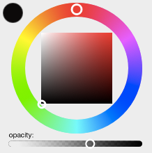
I have so far made it possible to resize the color wheel, to fill less if needed. What i have achieved looks like the second image
update: progress being made!
i’ve sorted the graphical part, now i just need to fix the focus region… because that is still being directed at the top left corner…
Yeah i have thought about implementing sliders, although i doubt it’s going to happen any time soon. I still have so much to learn about Qt that i simply do not feel comfortable enough to try to fully implement something from scratch. if someone else doesn’t do it, i’ll probably try at some point.
I’ve thought about the sliders… if i were to implement such, then to make everything useable i would have to remove the color wheel resize ability again. That is, if i were to implement them in such way as you described @manu
Unless if it is possible to make the sliders popup when you hover, when the layout gets too small. I’ll try to come up with a mock of how it would be possible to do. Screen space is a thing that i think often goes to waste in software development, and in animation i think it’s really crucial to be able to use as much of the screen as possible to draw on.
I’m glad that you are interested in looking into the UI. I work with a laptop most of the time so I agree Pencil could be better with a UI that lets you get more space for your drawing. I think the left hand side where the drawing tools are also wastes space. Two columns for the tools but one should be enough IMO, problem is just that we also need somewhere to show the tools preferences.
Maybe also a “full screen” button could be of use. E.g. Krita use Tab to switch off the UI and go full screen.
Yes i agree, it’s too much waste that the tools are taking up two columns. It shouldn’t be too hard to change though, so that should be an easy fix. If we could position windows next to each other, that would make it possible to let the tools panel have it’s own space. If this is possible, i think it should be added.
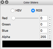
Great improvement!. I personally would recommend to put the “current color block” below the color wheel instead of having it below RGB (or HLV) values.
I too would prefer that and it’s something that i will look into. It will most likely happen around the same time while i’m trying to split the color wheel and the inspector. Atm. it’s been positioned below because that takes less space, but it will be moved, and most likely to the bottom left corner of the colorwheel. This time around i just mostly wanted to get the colorwheel improved
This approach can show some free space on the Colour wheel panel, and it helps a lot having the opacity next to the colours… and the SLIDE feature is just the right idea!
And your mockup is free from the HSV/RGB information (which is a plus for me). Still I think “we” (developers) should transfer that information (HSV/RGB) to an extra lockable window to be docked as desire, or just selecting them from a drop-down menu instead and merging the selected information with the colour wheel, while not taking so much space on the right panels.
I follow your new issue in GitHub (#432) and I was not able to understand where did you get the “colour bar”! below the Alpha channel on your gif bug (?)
I am using Win8.1, it maybe be the reason why it is different.
But anyway, I would like to add that I tested the same elements here and it is working fine.
The colour bar? it is just the current color block which has been squashed together. Regardless of that, you say that when you change the alpha value, you can see the color get less visible in that specific block?
I’m on OSX and using Qt 3.6.0.
edit: ohh… you mean why it’s placed below? well that’s a change i’ve made in the PR.
Yeah, I meant why it was placed below, but after a while I got it
I misunderstood your issue explanation at GitHub. I thought you were talking about the Alpha channel effect while drawing in the canvas (which is working fine as I mentioned). I did not even think about the colour block, but it can be very handy to have it updated correctly in order to check our colours on the document
@highkillerdk,
I would like you to try the flowing steps and check them. I found out various weird behaviours (Bugs ?) while following your issue #432.
Follow the next steps in sequence since they are all interconnected
USE THE RGB colour option: #1- Open Pencil2D and draw some lines. Change the alpha to a 25 and draw another lines: Result: the Colour Block shows a full-colour (BUG 1) while the intensity of the strokes on the canvas were diminished due to the effect of the alpha (no bug) This I believe is what you have described as issue in GitHub
"2- Select another colour on the Colour Palette and draw some lines again. The Alpha value reset from 25 (previous selected value) to its default value (255) (BUG 2 ?) and the line strokes on the canvas shows a full colour applied (no bug) #3- look what happens when you open Pencil2D and BEFORE drawing anything on the canvas you just select any colour on the Colour wheel/Colour Palette AND change its Alpha channel to let us say 25: now drawing some lines the Colour Block becomes transparent (BUG 3), showing only the background colour presented on the Colour Wheel’s Panel.
Now using the HSV colour option, things “may” change the above a little bit (but a bit tricky as well): I managed to get the colour-block to show me the correct colour AND correct alpha channel (sorry not able to reproduce it consistently)
I think you’re on to something here, i have managed to reproduce #3 many times now but as you mention it does not seem to be possible to do it consistently… however it seems that after you have made it work one time, you have to click on the spin box to change its value, then change color and again, type in some alpha value without using the arrows. That should make it update, at least i can make it do it 3 out of 4 times when i do it but then it becomes inconsistent again.
When i tried to split the sliders and the wheel into two separate windows, i noticed that if i had the same widgets ie. having the inspector in both windows, it would only update the alpha value on the color block in the other window, as if its waiting for a new input before it can update the alpha… and it’s strange because it’s only doing this with the alpha value.